Monday, 23 May 2016

Module Evaluation

Extended practice has allowed me to enjoy graphic design again because I’ve been able to write my own briefs and be more selective in the live briefs I answer. That said, retrospectively I’d question how useful some of the briefs have been in terms of developing a specialised practice. For example, briefs 6 and 8 have little relation to where I intend to go with my practice, and I wish I’d done more briefs based around sport.

In my opinion by far the most successful brief in my submission is brief 7, which was undertaken around the time I’d planned my progression after university. The strength of this brief and the enjoyment I found in it (and to a lesser extend brief 9) really helped reassure me that it was plausible for me to progress into a design role within the sports industry. More briefs like these would’ve given me a stronger portfolio in the context of my niche within the sports industry, so I’ll continue to work on briefs like these in my own time after finishing uni to strengthen my portfolio and aid my progression.

During COP3 I struggled to apply the Nietzschean principles practically, and this was a problem I found occurred again in brief 4 - this confirmed to me that it’s more important for design to be functional (something I try and make all my work) rather than to make it easily identified by an umbrella term such as modernist or postmodernist for example. This confirmation made me less self-conscious about my work because I knew that my research generally had a heavy influence on my outcomes so I could be sure they were functional. For example, looking through Square.One’s portfolio of school logos and going to the National Football Museum influenced the development of the final outcomes, which made the final visual quality for those briefs strong as the decisions were informed. 

This module has seen me work on a vast range of briefs and, while this waters down the concentration of important briefs for my portfolio, it’s also given me a lot of experience working with different types of people (illustrators, textile designers, professional designers, and a band) which proves that despite having a niche I can be versatile with my work. This versatility is shown best in brief 3 where I’ve worked on product development as much as on graphic design. On top of this it’s also given me a much wider experience of communicating with different people on briefs, which can only benefit me.


In summary, extended practice has benefitted my work because it’s shown me a clear area of strength within my work (being work where I’m the target audience), which has in turn benefitted my confidence and sense of direction for my progression beyond university. I also feel like I’ve gained something from every brief I’ve done, be it something I can talk about in an interview as an example of a quality I possess, be it providing me more experience communicating with different people, or be it benefitting my portfolio. In this sense I feel like I’ve been successful in extended practice.

Wednesday, 20 April 2016

Euro 2016 Posters - Flyer Map Development and Illustration Edit

Initially I wanted to use some sort of pattern to highlight where the rivers were in the maps, but after some experimentation I found that using a pattern was too garish and distracting. 


This was made even clearer when I tried applying a pattern to the grassy areas. Using the 25% tint as a block colour for the rivers/grassy areas made them just as clear but much less garish. I was slightly concerned that they were quite dominant though, so I tried keeping them white and using the 25% tint as the background, but the coloured background made the map difficult to look at.


Seeing the different variations in context confirmed that using the 25% tint as a block colour for the rivers and grassy areas was the correct choice - the coloured background completely dominated the poster and the patterned rivers were inconsistent with the rest of the design.


Joe was unable to edit the original drawing for the Germany poster to alter the colour of the skin to match the other 4, so I photoshopped it using the skin tones from the Spain poster in place of the existing skin tones, which made the player look ill.


The updated poster looked like this, and we agreed that it fitted in as a set with the other 4 much more than it did beforehand.


The makeshift labels I had in place on the England and Germany posters used 8pt Gotham Book, and I felt this size worked well so I continued using this typeface. Creating them in Illustrator rather than InDesign allowed me set guides precisely to the edges of the text, meaning I could ensure that all the labels had a consistent 1mm gap between the text and the border. The borders are 0.5pt thickness so they'll still be somewhat visible but less bold than the text, and the background of the label is the same colour as the background as the poster they're placed on, making the whole label slightly more discrete. The "M" signs signify a Metro/Train station.


With all these changes and decisions implemented the flyers look a lot more complete as a set and the Spain and Germany ones in particular look a lot more visually balanced.


Monday, 18 April 2016

Euro 2016 - Poster, Poster Tube and Flyer Development

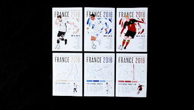
Joe sent me the illustrations for the other three posters, allowing me to take colours from them and finish of the set of posters, which will look like below.


This also allowed me to finish of the stickers using the same colours. We've decided that it'd be more appropriate to use stickers with the players names on them on every face of the poster tube rather than using the Euro 2016 logo, as this makes them easier to recognise when being sold in a shop or on a stall. 


The posters tubes would likely be contained in a big box (birds eye view below) so having the players names on the end of the tubes rather than the logo makes searching for the desired poster far more time-efficient. Having text on them also allows them to be sorted in various ways, be it by country or surname, making the searching process even quicker.


The colours from the illustrations have also been applied to the maps on the back of the flyers, which now look like this:


There are differences within the maps because of the difference in geography of the various cities - making some of the maps more visually interesting than others - the Spanish and Belgian ones look particularly empty. A consistant them across all five posters is that the rivers and grassy areas are very difficult to identify without a bulky label (as is exemplified in the Germany poster). Coming up with a different way to identify rivers and and grassy areas would solve both these problems as there are large areas of water and grass in the Spain flyer and a grassy area in the Belgium flyer that would balance out the colour on the map.

Other development that needs to be done is for me to devise a consistant system of labelling key roads and landmarks across the maps, and for Joe to try and edit the illustration of the Germany player to change his skin tones to match the pinker tones in the France, Belgium and Spain drawings, as we both feel that currently it doesn't match the other four. If we can't resolve this we may end up dropping the Germany poster and using the others as a set of four, but this isn't ideal.

Saturday, 16 April 2016

Football Programme Covers - Alternate Colours

Joe and I initially designed the covers in red and dark blue as we know these are the colours that are most commonly associated with football clubs. We confirmed this by looking at how we'd apply colour to to the other teams in the Premiership.


The programmes done in other colours would look something like this without an illustration on them, showing how easy it is to apply the template across numerous different clubs. 

Whilst the black and white cover loses some colour, the club it's associated with (Newcastle United) has very iconic black and white striped shirts, so it's still appropriate for the particular team despite the lack of colour.

Due the the light hue, the Watford (yellow) one required a thin black stroke around some of the colour in order to make the colour more prominent against a white background, whilst this differs from the other colours it's still appropriate to the club as they wear yellow and black shirts. 


Thursday, 14 April 2016

Harri Larkin - Logotype Development

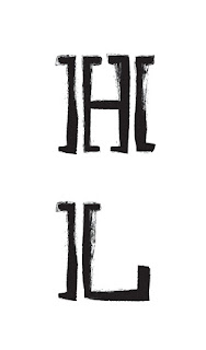
Harri messaged me earlier saying they were struggling to fit the logo onto certain bits of merchandise and asked if she could have files that were just the text. How the logotype could be used in isolation wasn't something I'd previously considered, but the below uses match the aesthetic of the logo and are in a different aspect ratios to the circular logo. These variations provide the band with plenty of options.