The logo for the competition lends itself well to circular stickers.
As the logo is more decorative than the logotype we're using it for the cap where it's more visible, we'll use the logotype on the base.

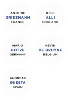
We're also going to have some stickers on the side which will identify which poster's inside, we're using type for this rather than the illustrations because at the small size the illustrations will lose a lot of their detail whereas we can set the text specifically for this.


The large variance in the different lengths of the player names provided problems as we wanted the middle line of text to be the longest in order to complement the circular shape of the sticker. For this reason I had to see how all the stickers would look as a set rather than just using one as a template.
Whilst using Steelfish helped shorten the lengths of the lines of text due to it being a tall font, however, it wasn't legible at small sizes so it became clear that I had to use Gotham for each line. After some development I found that using 10pt book for the top line, 12pt bold for the second line, and 8pt book for the bottom line was the best combination for all the stickers.


No comments:
Post a Comment