Tuesday 15 December 2015

Harri Larkin - Logo Development

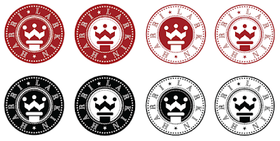
Harri liked the new design, but requested the lettering be a bit thicker, and wanted to see it different colours in the same way the red and black was combined.


Increasing the thickness of the lettering does make the words stand out more, but the colours don't really do much for the logo as it overcomplicates it even further than the texture, which I wouldn't use.


Harri was really happy with these, and wanted to keep them all to decide which one to use after discussing them with the rest of the band.

Wednesday 9 December 2015

Harri Larkin - Logo Development

I started by varying the brushes and line widths of all the vector lines within the logo, and found the limits of the extreme grunginess where the text was still readable and the minimal grunginess that was still noticeably not clean.


I decided to stick with the less grungy one because from my side of the design process I felt it important to champion the readability of the text. I used a textured background to make the logo grungier without hindering the readability further, as well as developing a red and black version of the two possible logos as the band have had difficulties deciding between the two colours.


Knowing that they've been having a difficult time deciding on the colour, I told them first to decide which row they prefer, because then I can talk about colour within the set and the potential advantages and disadvantages of each one.

My favourite is the below one however, as the high contrast makes the crown and text as visible as possible, as well as it having a more powerful feeling to it which gets saturated somewhat with the red.


I'm waiting to hear back from the band before doing anything else.

Tuesday 8 December 2015

Harri Larkin - Stickers

I received these photo's earlier from Harri, who thanked me for the time and effort I'd put into the stickers. 


She also asked if I wouldn't mind spending a bit more time on the logo as she was more impressed with my ideas than the ones from the album artworker. In return she offered to send some money back for me with our mutual friend at Christmas. This was something I accepted straight away, as they're clearly pleased with my work and I thought it a good idea to establish a good working relationship with them as it could lead to further paid work in the future either with them or others from Bristol Institute of Modern Music.

She wanted the logo to look a bit grungier, sending me the below photo of an example. While this is very doable, finding a balance between the desired effect and retaining the legibility of the letters may be quite difficult.


Thursday 3 December 2015

Harri Larkin - Logo Mock-Up and Stickers

The description I received was that they wanted a chess piece as the symbol, and the text to say either the full band name or just the letters HL. Based on their further guidance I produced the ideas sheet shown below. 


I chose a knight as the piece to use because it's arguably the most illustrative of all the chess pieces and is asymmetrical, which makes it more of a symbol and less of a badge. 

Whilst it followed their instructions it ended up looking very corporate and clearly wasn't suitable for a band at all, especially given that they really like The Ramones logo, which is very different to the above mock-ups.


It was a bit frustrating that their guidance led in the complete opposite direction to where they actually wanted to go, so I told them to leave it with me a couple of days and I'd send them something back that was more suitable. I rang my friend to tell her I'd had some ideas and asked if her housemate was available to talk about them. I sent the below screenshot to my friend and started talking to Harri, the lead singer of the band via text message.

I used the knight symbol in a badge-like design that's clearly been influenced by The Ramones logo to make it more suitable for the band. I also used a symbol for the queen in chess as well, as it draws less comparisons with banks than the horse and so feels less corporate. I tried to use more whitespace to try and keep it slightly more feminine than The Ramones logo though.

Unfortunately by this point the person who's doing the artwork for the band's first album had offered to do a logo as well, but Harri liked these a lot and asked if she could use them as stickers, and potentially as the logo if she and the band liked them more than the other proposed logo.


Harri particularly liked the top right one and asked to see how it'd look in two colours, black and a dark red. I feel it looses something when in two colours, as shown below.


To try and avoid the band picking one that was sub-par I did the below variations too, which I think all look better than the 2 colour ones.


I set up the ones they wanted to use for stickers in the way for them with bleed and crop marks as the website they were using required as Harri wasn't comfortable doing it herself.


Saturday 28 November 2015

Harri Larkin - Context Research

I've been approached by a friend of a friend asking me to design a logo for their band, Harri Larkin which is based in Bristol.

Having spoken to the band about the type of music the band produces, she described it as "alternative indie that's influenced by Paramore, No Doubt, and the Red Hot Chilli Peppers". The bands they referenced as having nice logos were The Ramones and The Sex Pistols, and they like the scratch look of The Libertines and My Chemical Romance, all of which are shown below.


The aesthetic to go for seems to be some sort of scratchy or messy unorganised text with a black and white illustration, the shape should either be circular or horizontally rectangular, doing this things will allow the logo to carry over the connotations of these bands to Harri Larkin, making the logo successful in terms of communicating what type of music the band play, which is important for a new band.

Monday 23 November 2015

City Under The Floorboards

I was contacted by Simon Pickles who was working on an independent film called City Under The Floorboards, he asked me if I could do a logo for the film.

After seeing the initial sketches people working on the film had made and seeing the mood board they linked me too, I had a rough idea of what sort of thing was needed for the logo.

I e-mailed them the following three screenshots, the logo, and how the logo could work as an image for a social media page.


The layout of the text is similar to one of the ideas they sent me, but slightly more aligned. I incorporated the gender symbols into the double O, making the female one more prominent than the male to represent the control she has in the relationship in the film. The horizontal line from the female symbol separates the top and bottom halves of the logo like floorboards, with the silhouette of a city skyline pointing downwards to try and stress the idea of it being under the floorboards. The lights that are switched on in the buildings are meant to be somewhat of a reflection of the lettering in the top half to try and add balance to the logo. I chose to use Avenir bold because it's quite bulky and clear without being overly masculine.

I'm going to wait until I hear back from them before I do anything more on this project.

Saturday 14 November 2015

A Clockwork Orange Book Cover - Cover Copy

I started by adding in the rest of the cover copy into the golden ratio grid, making the quotes on the back slightly bigger than the rest of the text. I used Futura on the back for continuity, and used the same process for creating my own letters for the quote on the front. I found that with the extra type added to the front, the title text no longer stood out quite as clearly as before, so I changed it to make it more aggressive-looking to secure it's position as first in the hierarchy.


Making all the text on the back cover the same size made the page look more balanced than having larger lines of text at the top and bottom. I also found that the title type looks more aggressive when used in conjunction with plain thin lettering because of the extra contrast.


The orange penguin logo against the orange spine didn't stand out very well, so I tried inverting the spine colour and the text colour, but this didn't look right, so I instead added a small white block behind the logo, and changed the colour of the text to white instead of the 10% orange in order to match this.


I got some feedback that said the main title text was difficult to read, so I added the original brush type in 50% orange behind the more aggressive one, making the text more readable while keeping the aggressive undertones.


The covers look like this mocked up


Friday 13 November 2015

A Clockwork Orange Book Cover - Lemony Snicket and Harry Potter Book Covers

Having looked at the previous Clockwork Orange book covers I was undecided as to if I should use some form of imagery or not. There's a famous saying that a picture paints a thousand words, but a book has hundreds of thousands of words, so surely a single image is not enough to be suitable for a book.

The idea of books is that you use the words to create your own images in your mind, and having imagery can have an influence over what you picture in your mind without you knowing. They can also be quite misleading, for example, the illustrations on the front of the "Lemony Snicket - A Series of Unfortunate Events" books are very similar to the ones on the Harry Potter books, the most successfully sold book series of all time, in an attempt to lead the consumer to think they're similar books.

For these reasons I'm keeping my cover purely type-based.


Lemony Snicket - A Series of Unfortunate Events


Harry Potter

Wednesday 11 November 2015

A Clockwork Orange Book Cover - Layout and Typography Experiments

I wanted to use the golden ratio as the basis for a grid because of how it's natural connotations are shared with an existentialist way of thinking.


After seeing that the colour scheme of the Penguin label was black, white and orange, I decided that I would use orange as the main colour in my design, but it would be more subtle than the use in the three alternate movie posters I looked at in the last blog post. I used the specific orange from the Penguin logo to make a colour scheme to try and make the the labels fit in with the rest of the design. I set out to use black, white, and 100%, 50%, 20%, and 10% tints of the Penguin orange. I found that the 20% and 10% looked more pink than orange anyway, which helps avoid the cliche of using orange as the dominant colour.


I then initially set out the type within the grid, using Futura because of its natural connotations. I increased the tracking to try and represent freedom and individuality within each of the letters, a theme central to the plot of the story. I used the 100% orange for the spine to fully separate the front and back covers to represent the struggle between two sides of Alex's thoughts; his own and the ones created in him by the Ludovico Technique.


I found that by using thinner letterforms the sense of freedom and individuality is increased.


Rather than using a lighter weight of Futura a decided to manually create the letters myself by tracing the existing type in Illustrator to further add to the sense of individuality with the imperfections that inevitably come with it.


This allowed me to experiment further with the concept behind the type. I tried using different brushes on the lines to make the text even more imperfect, as well as filling in the counters to try and represent more clearly the meaning of the phrase "as queer as a clockwork orange", which is something that looks normal on the outside but is different on the inside.


Whilst the experiment with the counters does communicate what I wanted it too, the block use of the 100% orange makes it the primary colour in the cover rather than the lighter background, which is a bit cliche, so I decided not to look any further into this.

The use of a brush made the text look hastily rushed and slightly aggressive in it's formulation, which fits in with the nature of the story, so this is the typography I chose to go forward with. 

A problem with this is that it's not very convenient to trace all the letterforms manually so I can apply the brush stroke. Fortunately this won't be necessary as the type isn't very readable at smaller sizes, and it needs to be black to make it properly readable even at 12pt, which is very restrictive. Given this, I'll just be using a thinner version of Futura for the blurb rather than my traced version, as more thought will have been put into readability at small sizes for the proper fonts than my own version.