Showing posts with label Brief 01 - Snooker Scores App. Show all posts

Friday, 23 October 2015

Snooker Scores App - Notifications and Downloads

Notifications

I turned on the notifications for CSKA Moscow vs Manchester United last night to take note of what the Goal Live Scores App notifies you about, these were:

  • Team line-up information
  • A reminder that the match is on 30 minutes before kick off
  • Kick off
  • Goals
  • Half time
  • Start of second half
  • Full time
All the notifications took the below format


With this in mind I'll need to design notifications for:
  • A 30 minute pre-match reminder
  • The start of a match
  • A player scoring a century break
  • The end of a frame
  • The half time interval
  • The end of the interval
  • The end of the session

The notifications from Facebook and Twitter have a similar presentation to those of the Goal Live Scores App, a symbol/image on the left with two lines of text on the right, the top of which is in bold.


It seems that this is a convention that needs to be followed due to the similarities between notifications from all apps, and even notifications from the phone itself, which doesn't leave me much wiggle room.

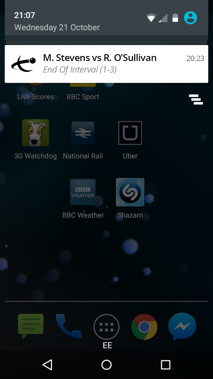
The notifications for my app will look like this


When I tested the full WSA logo on the notification it was too small and the text looked messy, so I decided to use just the symbol. I stuck to black rather than one of the greens because it looked sleeker due to sticking to the grayscale colour theme of the rest of the notification box.

Download

The app looks continues it's look into the the Google Play store easily as shown below.


Wednesday, 21 October 2015

Snooker Scores App - Visual Development

I indicated what the icons should look like on my scamps, and initially made them to look like below, where they're also place in the same position as they are on the scamps. I also but the WSA logo in the top corner as indicated on the scamps.


This upsets the balance of the screen because of the darkness of the logo and the icon on the left. I found inverting the colours in the logo and changing the left icon slightly fixed this.

Swapping the positions of the left and right icons made the screen look more balanced as well, is it then made the snooker player point towards the middle of the screen. Extending the active icon's background across to the edge of the screen helped separate the top section from the main results, as did swapping the 10% and 20% greens around in the top as shown below.

I also added a small shadow over the main results to help separate them from the top navigation section and to suggest that the screen continues below the bottom, as there's no immediate suggestion that the page scrolls down.

I also decided to get rid of the text either side of the arrows, as they looked somewhat like headings above the columns of text, which could've potentially caused confusion.


By making this sort of style consistent across the rest of the pages drawn up in the scamps, I produced the below screens.


I inevitably found that some screens didn't need as much space as others, which left a large empty space below it. I decided to watermark the WSA logo in this space as it's something I could do consistently across the app, and the logo in the top left corner isn't particularly clear because of its small size.

I decided that wherever there were 4 or less results on a screen, I'd display some information about the games below them to fill out the screen a bit as the screen looks very empty without this, as displayed in the screen that displays the semi-final games.