Showing posts with label
Brief 09 - Euro 2016 Illustrative Posters.
Show all posts
Showing posts with label
Brief 09 - Euro 2016 Illustrative Posters.
Show all posts
Initially I wanted to use some sort of pattern to highlight where the rivers were in the maps, but after some experimentation I found that using a pattern was too garish and distracting.
This was made even clearer when I tried applying a pattern to the grassy areas. Using the 25% tint as a block colour for the rivers/grassy areas made them just as clear but much less garish. I was slightly concerned that they were quite dominant though, so I tried keeping them white and using the 25% tint as the background, but the coloured background made the map difficult to look at.
Seeing the different variations in context confirmed that using the 25% tint as a block colour for the rivers and grassy areas was the correct choice - the coloured background completely dominated the poster and the patterned rivers were inconsistent with the rest of the design.


Joe was unable to edit the original drawing for the Germany poster to alter the colour of the skin to match the other 4, so I photoshopped it using the skin tones from the Spain poster in place of the existing skin tones, which made the player look ill.

The updated poster looked like this, and we agreed that it fitted in as a set with the other 4 much more than it did beforehand.
The makeshift labels I had in place on the England and Germany posters used 8pt Gotham Book, and I felt this size worked well so I continued using this typeface. Creating them in Illustrator rather than InDesign allowed me set guides precisely to the edges of the text, meaning I could ensure that all the labels had a consistent 1mm gap between the text and the border. The borders are 0.5pt thickness so they'll still be somewhat visible but less bold than the text, and the background of the label is the same colour as the background as the poster they're placed on, making the whole label slightly more discrete. The "M" signs signify a Metro/Train station.
With all these changes and decisions implemented the flyers look a lot more complete as a set and the Spain and Germany ones in particular look a lot more visually balanced.


Joe sent me the illustrations for the other three posters, allowing me to take colours from them and finish of the set of posters, which will look like below.


This also allowed me to finish of the stickers using the same colours. We've decided that it'd be more appropriate to use stickers with the players names on them on every face of the poster tube rather than using the Euro 2016 logo, as this makes them easier to recognise when being sold in a shop or on a stall.


The posters tubes would likely be contained in a big box (birds eye view below) so having the players names on the end of the tubes rather than the logo makes searching for the desired poster far more time-efficient. Having text on them also allows them to be sorted in various ways, be it by country or surname, making the searching process even quicker.
The colours from the illustrations have also been applied to the maps on the back of the flyers, which now look like this:


There are differences within the maps because of the difference in geography of the various cities - making some of the maps more visually interesting than others - the Spanish and Belgian ones look particularly empty. A consistant them across all five posters is that the rivers and grassy areas are very difficult to identify without a bulky label (as is exemplified in the Germany poster). Coming up with a different way to identify rivers and and grassy areas would solve both these problems as there are large areas of water and grass in the Spain flyer and a grassy area in the Belgium flyer that would balance out the colour on the map.
Other development that needs to be done is for me to devise a consistant system of labelling key roads and landmarks across the maps, and for Joe to try and edit the illustration of the Germany player to change his skin tones to match the pinker tones in the France, Belgium and Spain drawings, as we both feel that currently it doesn't match the other four. If we can't resolve this we may end up dropping the Germany poster and using the others as a set of four, but this isn't ideal.
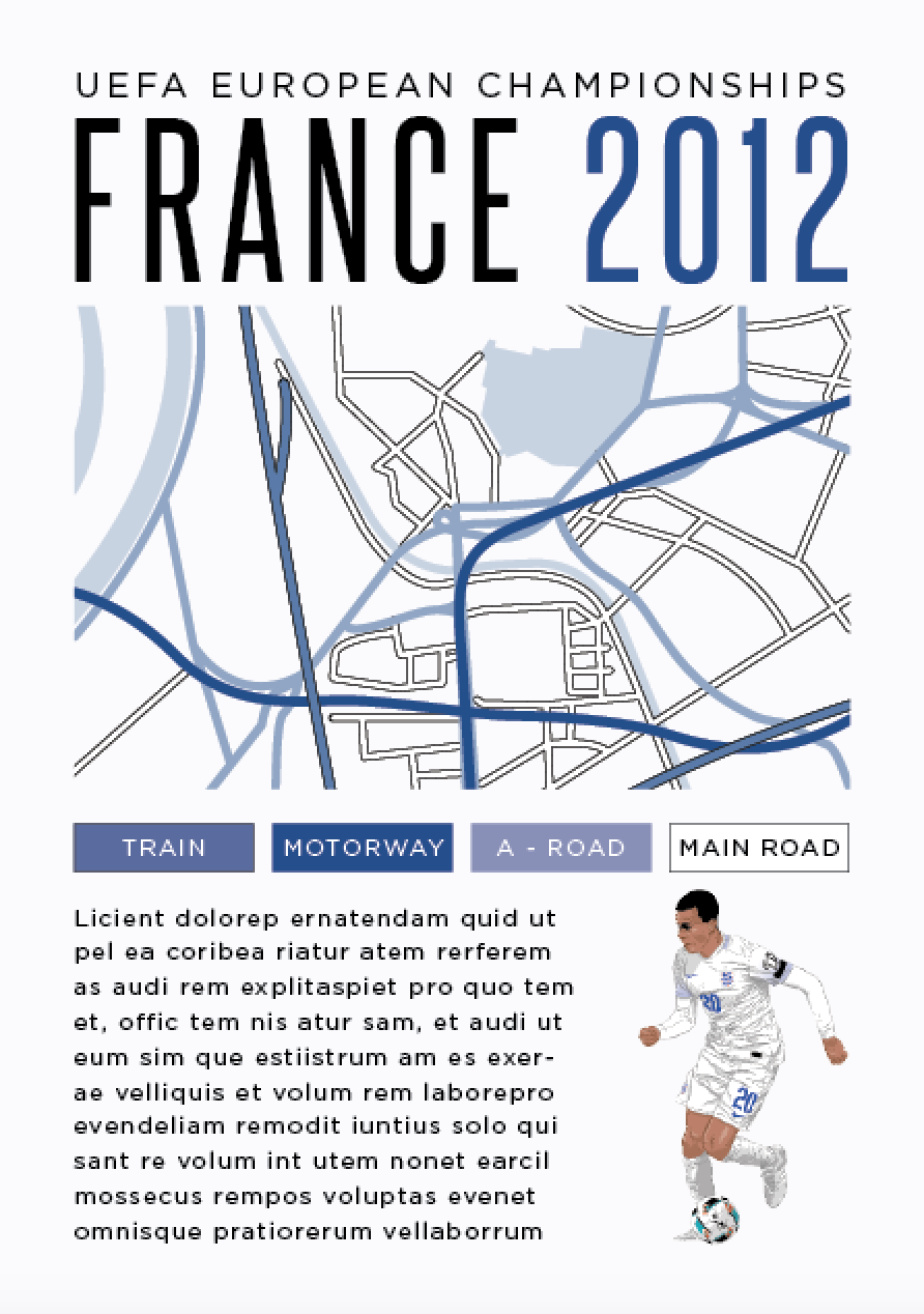
Using the map I'd made and by carrying the grid over from the front gave the below result, although it was clear that Steelfish didn't work very well as a key because of how narrow it is. Replacing it with Gotham made it more readable and putting blocks of colour behind them meant the bold and blocky look of Steelfish was still there.

 Joe and I discussed what text should be on there and came to the conclusion that directions weren't as necessary as we'd first thought as if someone was using the map for directions to the stadium they'd be near the stadium anyway, meaning there'd be signs up. Instead we decided a more important use of space would be to put the dates and times of the games, this would warn locals about when the surrounding area will be busy. To do this we didn't need all the space the grid allowed us, so we added in a sub-heading which gave the name of the stadium and the city, something which was previously missing - I used Steelfish over Gotham as I needed to use a narrow font because of the limited space.

 Adding labels to the map identifying key roads and train stations aids the usefulness of the flyer whilst still allowing the text area to be used for the fixtures. Labels can also be added for rivers and public spaces to add a greater sense of bearing to the maps. When the different colours are applied for the German version of the flyer the map is still clear and the key still has noticeable differences between the different routes.

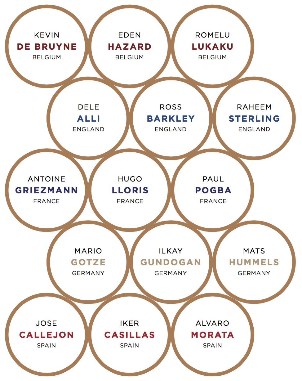
I looked into which stadiums and cities France, England, Germany, Spain and Belgium (the countries featured in our posters) will play their first game in and developed maps for those cities. I could only apply colour to the maps for England and Germany as Joe hasn't finished the other illustrations yet, so they're left in black and white (with the exception of a large river which will be white) for now.


After changing the maps to the England and Germany posters to the correct city they look like below. Because there isn't room on the key to put in rivers and large public space we left them white on the map to match the labels, making them applicable to all five posters. The alternative to this would be having the rivers in a pale blue and the public spaces in a pale green, which would disrupt the colour schemes of the individual flyers.