I recently went and worked with Square.One, a design agency in Sheffield, on a live project to re-design Royd Nursery Infant School's logo. The logo had to be red, blue and white, and be representative of the following qualities:
- Including Everyone
- Hardworking
- Thoughtful
- Sharing
- Supportive
- Kindness
I was also given this pack of documents that SquareOne had produced for schools and nurseries previously to use for inspiration and ideas.
After speaking with Michael (the Senior Designer) and Jonathan (Director) we agreed that my initial ideas weren't really suitable for a school where the pupils were so young as they were more symbolic than pictorial as shown below.

The idea behind these was that the hands and triangles were placed in a structured way to support each other, with the hands being representative of sharing and kindness and the triangles reinforcing the supportiveness. The circle around them is to try and represent inclusiveness, these are made from ribbons and triangles to try and reflect happiness and supportiveness respectively.
I then tried to think a bit more pictorially and ended up with these, but I they thought they were a bit cliche and simple and wanted to avoid using them.

My next set of ideas were much more appropriate. I took forward the idea of using ribbons and the circle shape to make a crest. I then worked on the idea of using the ribbons to form a letter R as well as to try and represent a maypole, something which requires all of the above qualities.

After discussing these ideas we decided that I should run with the maypole idea as it sums up everything the school was looking for and is appropriate as the school happens to have a maypole, but the shape should become a bit more abstract and extravagant.

We found these to be a bit too abstract, which was the problem I initially had with the triangles and the hands. After adding in the children and the pole it became a lot clearer what the image was, and that the lighter tones of red and blue made the logo feel more positive.
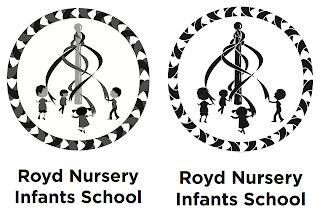
The final logo looks like this.

I also adapted it to work in greyscale and monotone
I then adapted these into uniform, a stationary set including letterheads, business cards and compliment slips, and a mock up what their new website could look like with the new logo.


This project took just over a week in total, which I thought was pretty reasonable given how slowly ideas came to me despite knowing that I'd be doing this brief a few weeks in advance of starting it. This was something I discussed with Michael, who reassured me that it's not something I should worry about.
I found the experience as a whole pretty enjoyable despite how slow it was in parts due to my lack of ideas, and was pleased with the outcomes I produced.

The idea behind these was that the hands and triangles were placed in a structured way to support each other, with the hands being representative of sharing and kindness and the triangles reinforcing the supportiveness. The circle around them is to try and represent inclusiveness, these are made from ribbons and triangles to try and reflect happiness and supportiveness respectively.
I then tried to think a bit more pictorially and ended up with these, but I they thought they were a bit cliche and simple and wanted to avoid using them.

My next set of ideas were much more appropriate. I took forward the idea of using ribbons and the circle shape to make a crest. I then worked on the idea of using the ribbons to form a letter R as well as to try and represent a maypole, something which requires all of the above qualities.

After discussing these ideas we decided that I should run with the maypole idea as it sums up everything the school was looking for and is appropriate as the school happens to have a maypole, but the shape should become a bit more abstract and extravagant.

We found these to be a bit too abstract, which was the problem I initially had with the triangles and the hands. After adding in the children and the pole it became a lot clearer what the image was, and that the lighter tones of red and blue made the logo feel more positive.
The final logo looks like this.

I also adapted it to work in greyscale and monotone

I then adapted these into uniform, a stationary set including letterheads, business cards and compliment slips, and a mock up what their new website could look like with the new logo.

This project took just over a week in total, which I thought was pretty reasonable given how slowly ideas came to me despite knowing that I'd be doing this brief a few weeks in advance of starting it. This was something I discussed with Michael, who reassured me that it's not something I should worry about.
I found the experience as a whole pretty enjoyable despite how slow it was in parts due to my lack of ideas, and was pleased with the outcomes I produced.