Monday 29 February 2016
Saturday 27 February 2016
Euro 2016 Illustrative Posters - Background Development
Joe said he thought the dates needed to be bigger, I was hesitant to do this because the dates were aligned with the year and I didn't want to change that as I felt they were visually balanced - rather than doing this I reduced the size of the cities so they aligned with the inner side of the 2 to increase the proportionate size of the dates whilst keeping the cities in some sort of alignment. Joe and I were both happy with this.


We wanted something that we could change the colours of for each poster to reflect the colours each individual team play for, this would allow each background to be more individually relevant but still work as a set. Between us we cam up with a few ideas:


We decided we wanted to do something based around the shape and design of the ball because of how the shapes within it have a similar sense of dynamism to the players. Joe's going redraw the ball at a larger size so I can look at creating something out of it.


We then started looking at how we could fill some space in the background as we both felt the posters looked very plain.

We wanted something that we could change the colours of for each poster to reflect the colours each individual team play for, this would allow each background to be more individually relevant but still work as a set. Between us we cam up with a few ideas:


We decided we wanted to do something based around the shape and design of the ball because of how the shapes within it have a similar sense of dynamism to the players. Joe's going redraw the ball at a larger size so I can look at creating something out of it.
Friday 26 February 2016
Saucy Fish Co - Initial Thoughts
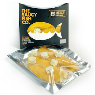
Having looked into the Saucy Fish Co.'s current packaging it looks as if they have 3 main types that exist at the moment; sleeves, boxes, and foil bag packs. I established the main advantages and disadvantages of each
Sleeves

Boxes

Foil Bag Packs
My Interpretation Of The Brief
The brief states that "We believe that fish is always the hero. So, we definitely don't want to hide it. Let the fish be seen in all its mouth-watering glory." This suggests there needs to be some sort of window for the product to be seen through like in the sleeve and the foil bag packs.
It also states that "we need to make sure that the packaging is designed so that it uses the shelf space as efficiently as possible", which means the packaging needs to be able to tesselate, something which only the box does currently.
"We know that some people are a little bit squeamish about touching fish. So, it would be fantastic if the packaging was clever enough to go straight into the oven" and "All of our packaging needs to be recyclable and lightweight." are statements than makes this difficult as there aren't going to be many materials that fulfil these requirements. It could be easier to make all of the packaging recyclable and devise some sort of way of getting the fish into the over without it being touched.
The material used for the packaging needs to be fairly thick and durable because it needs to "protect the product whilst it's on shelf and being transported home so ultimately enhancing the consumption occasion by ensuring the fish is as fresh as when it was caught."
Sleeves

- Makes the product visible
- Uses the brand logo as part of the packaging
- Plastic tray won't go soggy and is durable
Boxes

- Supermarket-shelf efficient
- Easily recyclable
- Doesn't show the actual product
Foil Bag Packs

- Irregular shape
- Non-recyclable foil
- Customer doesn't have to touch the fish
My Interpretation Of The Brief
The brief states that "We believe that fish is always the hero. So, we definitely don't want to hide it. Let the fish be seen in all its mouth-watering glory." This suggests there needs to be some sort of window for the product to be seen through like in the sleeve and the foil bag packs.
It also states that "we need to make sure that the packaging is designed so that it uses the shelf space as efficiently as possible", which means the packaging needs to be able to tesselate, something which only the box does currently.
"We know that some people are a little bit squeamish about touching fish. So, it would be fantastic if the packaging was clever enough to go straight into the oven" and "All of our packaging needs to be recyclable and lightweight." are statements than makes this difficult as there aren't going to be many materials that fulfil these requirements. It could be easier to make all of the packaging recyclable and devise some sort of way of getting the fish into the over without it being touched.
The material used for the packaging needs to be fairly thick and durable because it needs to "protect the product whilst it's on shelf and being transported home so ultimately enhancing the consumption occasion by ensuring the fish is as fresh as when it was caught."
Wednesday 24 February 2016
Football Programme Covers - Extension Over Different Teams
Joe was really pleased with the Liverpool cover, but suggested that the managers names be moved to the top of the squad list to they'd be aligned and make the lists more balanced.


With this in mind I re-created the layout for Everton, Sheffield United and Sheffield Wednesday as shown below. Joe had already sent me a rough outline for the drawing on the Everton cover, so I could re-position the text accordingly. The much shorter length of the text for the Sheffield Wednesday cover makes the word a lot taller in order to fill the full page width - although this is something that we'd consider making smaller again if it lessened the effect of the illustration. These are two reasons why it was important to develop a grid that had a lot of rows, as it makes it easier to deal with problems like this.


I'm now waiting on Joe finalising the illustrations for the front covers.
Monday 22 February 2016
Euro 2016 Illustrative Posters - Further Development
Joe sent me these files for the posters as his final drawings. Given that there's two I can use them to have a general idea of what space will be taken up by the images and left for text.


The new images were on a different ratio scale to the previous one he'd sent me which meant that there wasn't enough space to have any text at a particularly large scale.


Because of this I had to reduce the size of the images. This in combination with Joe's previous feedback that the word France needed to be bigger I found a text:image ratio that looked fairly well balanced by using increased kerning.

I then started to construct a grid where the columns were based on the positioning of the letters - this was done to try and keep the remainder of the text aligned in relation to the largest piece of text to try and make the text look as balanced as possible so as not to distract too much from the images.

Completing the grid with the information gave the below result. I found that Steelfish being a narrow font wasn't suitable for the remainder of the text as it meant that it all had to be quite large to be readable.


To find an appropriate font to use with Steelfish I looked back at some of the photos from the football museum to look and some of the better posters for some ideas.


I decided to use Gotham Book but with very wide kerning as this recreated the sort of wide and square look in these two posters but with more of a modern aesthetic.

By adding 2016 to the line of text that said France I could reduce the height of the line while still making it full width, doing this allows for minimal overlap of the text and illustrations. It's important that there is a slight overlap though as it helps assert the illustration as top of the hierarchy of information. The sub text had to go above the main text because it was too small to be readable with the image overlapping. The dates and cities remained in the bottom corner - the dates were sized to be as wide as "2016" to keep the posters looking balanced. The cities were sized in comparison to this at the same ratio as the subtext at the top is to the "France 2016", this is also to keep the posters visually balanced.

Upon separating the images I found the text left too much whitespace on the right side of the page, something which I didn't notice beforehand due to the guides and binding boxes.


Changing the size of the cities to be the same width as the dates solved this. I sent the below images to Joe for his feedback.


Sunday 21 February 2016
Football Programme Covers - Layout Development
Joe was happy to go forward with my suggested layout so I started looking at what information needs to fill the grid other than the names of the players. I looked mainly at the 3 programmes that informed the layout being a 3 column grid for some continuity. That these 3 are the more recent ones only helps this as it means the sort of information on them is still deemed to be relevant to the supporters by their respective clubs.
Recent and Upcoming Games
This information gives the fans a reminder of the teams previous result and when their next games are. Reminders of when the next games are are important for the fans so they can make arrangements for the games, so it's important to include this information.
Form Guide
Gives information about both teams last few results to give the fans an idea of how well each time is playing - helping the fans to get an idea of what to expect from the game. Useful information but not necessarily important.
Team Mascots
Information about the children who'll be walking out onto the pitch with the players before kick-off. This is trivial and generally is of no concern to most people. Doesn't need to be included.
Reverse Game
This gives information about the last time the two teams played each other. Similar to the form guide, useful but not necessarily important.
Sponsorship Logos
Definite requirement and probably an obligation to include because of the commercial aspect of the programmes and the industry.
Price
Needs to be included somewhere but it doesn't need to be prominent as programme sellers shout out the price like they're running a market stall.
Spine References
Generally only useful to collectors but is a nice touch on the Sheffield United programme from the current season was the information on the spine. There's no reason not to do something like this because there'll be nothing else on the spine.
Referee and Manager Information
Similar to the names of the players, the names of the referees and managers could be useful for supporters, and so should probably be included.
Safety Information
Definitely needs to be included, although only a couple of sentences are required.


When I was deciding on the size and line spacing of the text I used the text size on a recent programme as a reference to make sure it was big enough to be readable but small enough to not take up too much space - I chose the recent Sheffield United programme as the text on it had this balance. The text is in white to match the white-on-red colour scheme of the illustration, and the surnames are in a bolder weight because they're the names by which the players are generally known.
The crests above the two teams are in white to keep consistant with the text on the red stripe, this also limits the use of colour within each individual programme and thus adding to their commercial viability.
The text on the right column displays the relevant information discussed above - the font sizes and weights remain consistant with those on the red stripe. A thin line separates each segment of information to break up the space between them as well as to keep the back cover looking organised and tidy. Using photography within the information was too much of a contrast with the illustration and limited colour palette, so using that space to give credit to the illustrator and information about the cover image made the most sense to replace the photograph - this would usually be done on the inside cover of the programme but I felt the back cover needed some sort of image to accompany the text.
Joe and I wanted the front covers to work as posters which could be sold at a larger size for the same prize - for this reason it made sense to put the price on the front cover and the corporate logos on the back. The new premiership logo is fine to go on the front as it's directly related to football and is more illustrative. Putting it in the bottom right corner broke up some space.
The text on the spine, underneath the main heading, and for the safety messages were all meant to be as readable as possible. For this reason the safety message is in an area of the page with as few visual distractions as possible, the various pieces of information on the spine are well spaced-out, and the text below the title is a bit bigger than the rest of the text on the programme to increase its significance in relation to the very large text above it.


I sent this to Joe for feedback.
Wednesday 17 February 2016
Freya Williams Self-Promotion - Folder Development, Mock-Ups, and Stock Choices
Having discussed the the pink headings, the text alignment and the layout of the inside page with Freya over the phone this afternoon I remedied the layout and showed here the below layouts. Freya was keen for the pink headings to remain but shared my concern with the other points. These solutions add a lot more balance to the inside of the folder because the space used on the left page is now the same as on the middle and right pages, and the alignment of the text looks a lot neater when placed centrally.


Freya said it was quite important that as many of the images she provided me with be shown as possible, and that she didn't think text above the postcards, CV and cover letter was necessary as she wouldn't know what to write there. The below was the solution allowed for more images to be used while keeping the balance of the three pages the same.

She was really happy with these, and asked if I could do some mock ups for her PPP crit tomorrow, as her print slot isn't for another 2 weeks. She was happy with these.

I then spoke to Freya about stock and what she should use to print on. Finding some A2 pale pink stock to print on was the main priority because of how difficult it was - we ordered some from here at 240gsm which should be sturdy enough to act as a folder. I then suggested that we order some samples from G.F Smith to before deciding what to print the business cards, postcards, CV and cover letter on.
Tuesday 16 February 2016
Freya Williams Self-Promotion - Folder Development
I met with Freya yesterday to discuss the folders, there were a number of changes she wanted to make, these were:


Having made all the changes Freya requested the folder looks like below, all the changes improvement apart from the pink headings, which are counterproductive as they remove the boldness from the text. I also think that the images on the left should take up the same amount of space as the postcards, the text should be aligned with the postcards, and there should be a title and some introductory text to the images on the left. I'll discuss all this with Freya when we next speak tomorrow.


- Removing all the text from the inside left page to add more images in.
- Adding text above where the postcards, CV and cover letter will sit.
- Make the head text a dark pink rather than black.
- Try and avoid such a large blank space on the back page.
We also discussed what we should print underneath the business card, as her logo and name would no longer be visible were the business card to be removed. We concluded that we should have her logo, name and title as nothing else was necessary and this would provide the same information as the business card whilst not trying to cram too much into the small space underneath it.


Having made all the changes Freya requested the folder looks like below, all the changes improvement apart from the pink headings, which are counterproductive as they remove the boldness from the text. I also think that the images on the left should take up the same amount of space as the postcards, the text should be aligned with the postcards, and there should be a title and some introductory text to the images on the left. I'll discuss all this with Freya when we next speak tomorrow.


Subscribe to:
Posts (Atom)