Friday 29 January 2016

Freya Williams Self-Promotion - Initial Development

Being fairly unfamiliar with Freya's work, I didn't really go into this project with any ideas for her logo and was hoping she'd be able to give me some direction with this. She wrote out the name "Paigic Designs", which I traced in Illustrator to use as a logotype.


Having spoke to Freya about the logo I knew she wanted the name inside an oval which contained one of her patterns, of all the ones that she sent me, the below one fitted the shape the best due to how it has a circular shape. I edited it to enhance the colours, as Freya wanted the bright colours in the logo.


The logo developed as below until Freya was happy with it. In order to make the colours bright enough we had to increase the weight of the logotype a bit, which I wasn't keen on doing at first, but now doesn't seem like an issue because of how well it stands out from the pattern. Having the pink border rather than the black one makes the whole logo look a bit lighter.


Initially Freya was going have her postcards blank, but I suggested putting some information about the design on the back in the format of a conventional postcard, as shown below. This is something we'll work on more next time we meet.


My initial plan for the folder didn't change too much, although I thought it better to display the logo on the front page via the back of the business card so all the attention was on the business card. The pink background isn't necessarily pink, it's just a placeholder colour for the stock taken from the logo to use instead of a plain white background. The colour of the final background is something I'll discuss with Freya another time. This gave me a good start for the business card.


Initially the back of the business card looked like this.


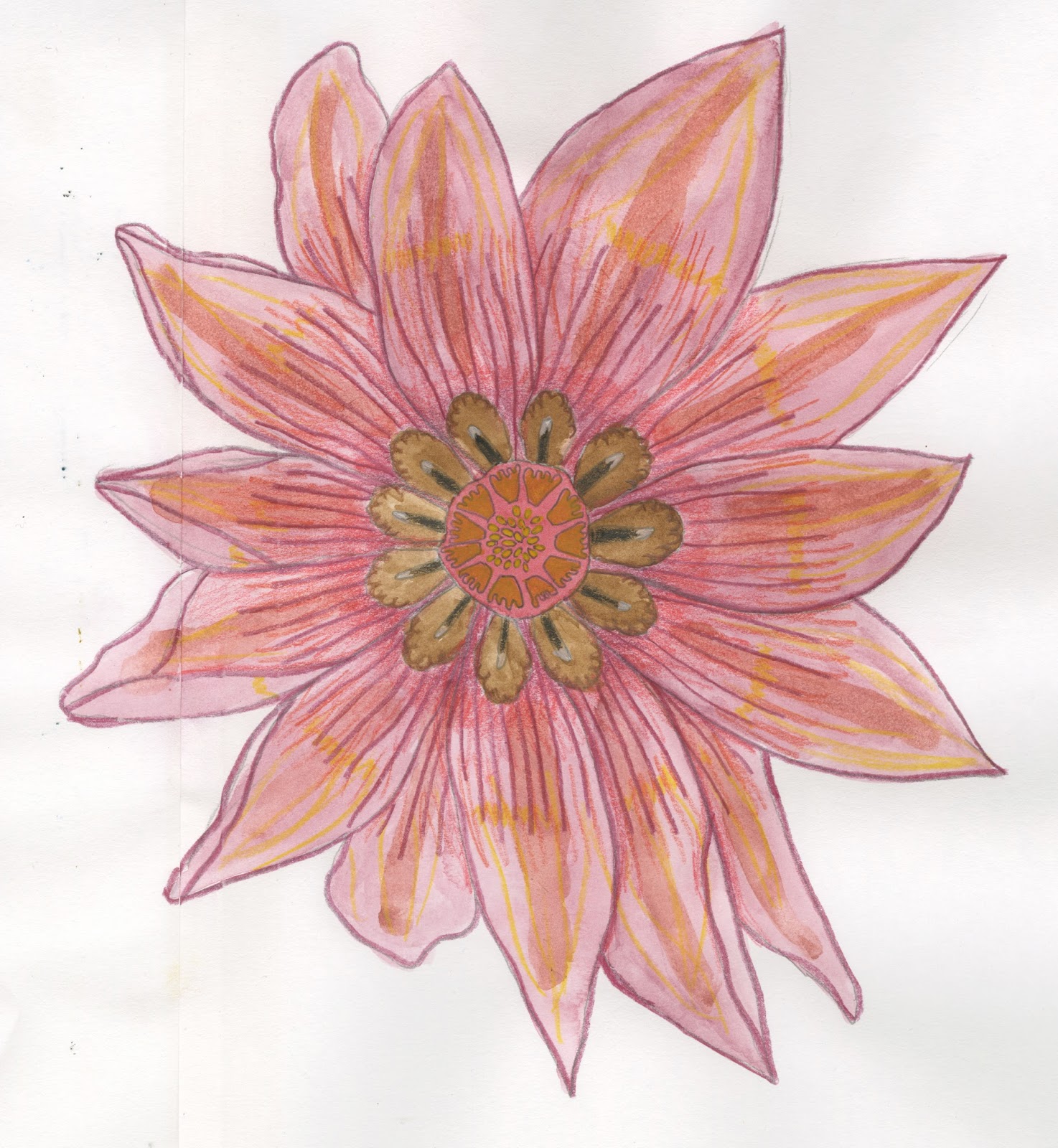
I feel like this works really well, but Freya was very keen on having some of her other patterns on the back of the business card, as well as wanting the ovular logo rather than the full image. The problem with this is that the other patterns she sent me varied greatly in colour as shown below.


I explained to Freya that this wouldn't work very well because of how the colours were too different, and she said that she'd rather me change the colours in the logo than in the patterns but she'd like to see some possibilities as to how they could look, even if they weren't very good. I showed her the below images, none of which look anywhere near as good as my initial idea to have the image from the logo large and on it's own.


Freya then suggested not having a logo on the back at all and just having the patterns in their original colours, instead having the logo somewhere fairly small on the front and put it in the folder with the front facing outwards. I'm sceptical about this idea and so am going to print out loads of different potential business card designs so she can see how they all look printed, I hope to convince Freya to go with my original idea by doing this. 

Thursday 28 January 2016

Football Programme Covers - Fan-Made Covers and Fanzines

Fan-Made Covers

A while ago I'd bookmarked this 'article' about Manchester United fans who'd been asked to design the programme cover for the 170th Manchester Derby as a competition. The readers of this website and the people that entered this competition are very much the target market for our own programmes, and seeing which entries Manchester United selected to as the finalists and which ones the article chose to praise will give us an indication of what's suitable for our programme covers.

They chose these 2 as the finalists


The article also praised these


A theme throughout was sans-serif typography, which suggests this is the way to go with our covers. The majority of them all were illustration based, which is reassuring given that we're using illustrations. Despite them all looking nice, none of them look like they could be easily extended as a back cover, it's going to be important to consider this when planning our own.

Fanzines

Fanzines also exist within football, although it's a dwindling thing at the moment, but because of the printing and cost restrictions on fanzines, they tend to be in black and white, occasionally having colour covers. Out of the 4 teams that Joe and I are doing covers for, only Liverpool still have a fanzine running - Well Red.


The covers for these fanzines have a similar old-fashioned aesthetic to some of the older programmes Joe found at the Football Museum, and given that Fanzines aren't very common any more, we should probably stay away from this sort of aesthetic.

Tuesday 26 January 2016

Freya Williams Self-Promotion - Meeting with Freya

I met with Freya today to discuss what she wanted - a logo that wasn't 'hyper-commercial', business cards, postcards with her designs on, and a folder to contain them all along with a CV and a cover letter which she will be writing.

We decided that we'd have a 3 fold folder that was slightly oversized A5 so it can contain postcards, the CV and cover letter easily. One of the pages will have samples attached to them so the folder contains something to touch, following this reasoning the folder will fasten with velcro. The front page of the folder will hold the business card.


Freya Williams Self-Promotion - About Freya

I asked Freya to briefly explain to me what her work was about and send me some examples of her best and favourite bits of work, this is what she provided me with:

I have had a keen interest in textiles throughout e​​​​​​​​education. Natural texture and historic methods particularly drove my studies. Historic technique and methods, for example, natural dyeing and stitch were of a big interest to me. Techniques of developing and recreating surfaces were a good part of my interest and development during GCSE and A-levels. There is an obvious connection between this and my uni work level 4 onwards. From level 5 I have continued to develop these interests but also a focus on colour and culture.


It seems to me that Freya doesn't have a particular way of working that she specialises in given the various different aesthetics of the work she showed me, so it doesn't seem particularly necessary to use any particular process within the production of her self-promotion.

A lot of of her work is florally based, so using light pastel colours in her promotion would reflect the feminine nature of much of her work.

She seems to like presenting her work with someone holding it, wearing it, or it being ready to be unwrapped, all things which result in it being touched. It'd be fitting to include some fabric samples because of this.